Below are several charts which yield a number of economic insights about the Alberta economy.
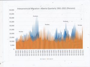
Interprovincial migration
The first chart illustrates the impact of interprovincial migration – people coming to and leaving Alberta since 1961.The chart shows five distinct periods associated with boom and bust conditions in the oil and gas industry. Periods where blue is dominant are boom periods where Alberta was attracting thousands more in-migrants than those leaving the province. These are periods of growing employment and occasional labour shortages. Where the brown colour is dominant, these are quarters when outflow of people exceeded inflows.
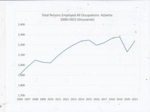
Employment
The chart below shows total employment, all occupations, for the province of Alberta since 2006. Alberta employment grows steadily until the financial crisis in 2009 but after a small retrenchment continued to climb to 2015 when the oil price crash led to serious weakness in employment. The chart notes a gradual recovery to 2019 and the dramatic fall in employment during the first year of COVID. Total employment still has not yet reached levels achieved in 2015 or 2019.
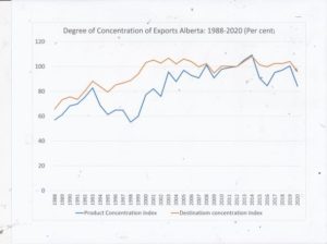
Concentration of Alberta Exports
The next chart illustrates the degree of concentration of export products by commodity and by destination. In other words, how much does an export economy rely on one product and one market? The source for the data comes from
According to Statistics Canada
The concentration ratio used to measure export concentration is the Herfindahl-Hirschman index, which results in values between 0 and 1. A value that is close to 1 (maximum concentration) indicates a very concentrated portfolio of export products (or of markets). On the contrary, values closer to 0 reflect a more equal distribution of export product (or market) shares.
The indexes used measure the change of the concentration ratio, relative to its value in the base year of 2012. So the index can be over 100 per cent relative to the base year.
The following chart illustrates the degree of concentration (e.g. the United States) by market destination and commodity (oil, natural gas and bitumen) over a period of three decades. The brown line indicates the concentration in destination markets (the U.S). The blue line denotes the concentration of products exported.
Both concentration ratios have moved higher over the past three decades. This stands to reason for two principal reasons: first the NAFTA agreement (and its predecessor the Canada-U.S. FTA) liberalized movement of goods and services between Canada, the U.S. and Mexico. Second since the early 2000s, oil sands production has grown significantly.
Dependence on one or two commodities and one market represents one of the most significant challenges facing Alberta’s current policy-makers. The measure is one metric- among many others- which suggests Alberta’s ongoing quest to diversify its economy has been unsuccessful. Given the oil and gas industry’s concerns over the long-term viability of fossil fuels, it is not surprising that considerable lobbying efforts are underway to bring the federal treasury onside to support carbon carbon and storage and blue hydrogen development.
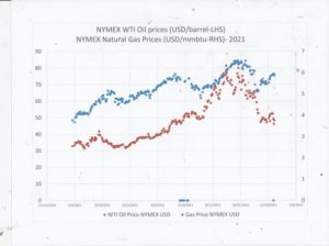
Energy prices
Alberta’s revenue picture brightened considerably in the last half of 2021 as the rise in oil and natural gas prices persisted and 2022 opens with prices well over $80 U.S. p[er barrel. According to Budget 2021, for every one dollar U.S. per barrel the average price remains higher for the full year an extra $230 million will be collected in royalties. In the case of natural gas, 10 cents per gigajoule means an extra $20 million. Alberta Finance’s forecast last February estimated that oil prices would average $46 U.S. per barrel and $2.60 per gigajoule. The “under-estimate” has meant that Alberta’s projected deficit has moved from $18.2-billion to $5.8-billion. There is some speculation now that Alberta might bring in a balanced budget for 2022-23. This would give Jason Kenney significant momentum moving into the April leadership vote.
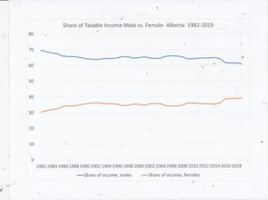
 Gender Income Inequality
This graph shows that the share of taxable income taken home by females since 1982 in Alberta has increased from 30.4 per cent in 1982 to 39.2 per cent in 2019. This is a dramatic shift from the historic dependency of females on their male spouses’ earnings capacity. The steady increase in female’s income share was arrested in 1993 at 36 per cent coincidentally with Klein’s elevation as Premier. Also coincidentally, the resumption of women’s share began in 2015 in the year when the NDP was elected. Coincidence does not mean causality although Klein’s cutbacks and Notley’s “restoration” of healthcare funding could have had an influence on these percentages.